BuzzFeed App Design System
Streamline design workflow, boost time to market
I lead strategy, design and implementation of a unified design system for the BuzzFeed apps. I tackled design inconsistencies and made updates faster by working closely with engineers to unify components and styles. I managed the project from start to finish, significantly improving app consistency and team efficiency.
Role: Lead Designer & PM
Duration: 4 months
Team: App Experience - PM, Android & iOS engineers, QA
Problem
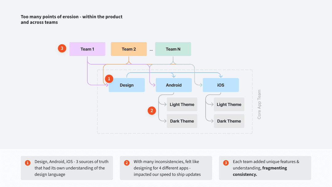
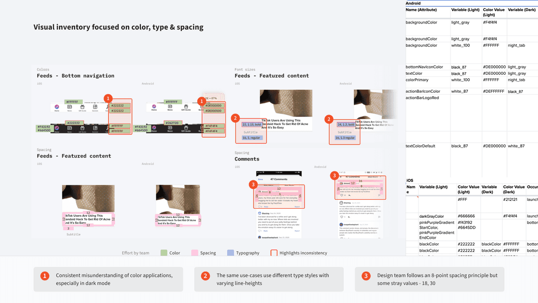
The BuzzFeed app had significant design inconsistencies which caused confusion, slowing the design-to-development handoff process. Visual cohesion across iOS and Android platforms, under both light and dark themes, got progressively worse with each new project. Design and engineering teams had their own understanding and application of styles causing a lot of back and forth during visual QA.
Goal
- Achieve and maintain consistency in the Android & iOS BuzzFeed apps
- Promote understanding of our visual language so it feels cohesive across platforms
Key Success metric: Achieve a faster time to market by reducing the average time taken from design handoff to launch.
Solution
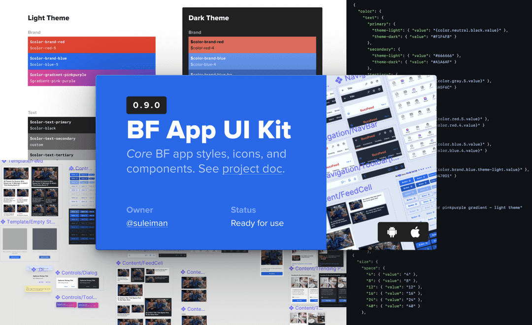
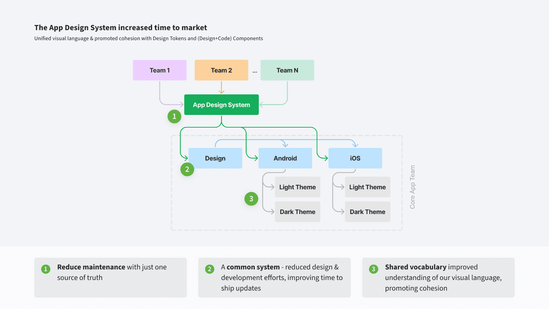
I built a design system aimed at solving the team’s need for a reliable solution that would last long-term and scale along with the product.
Approach
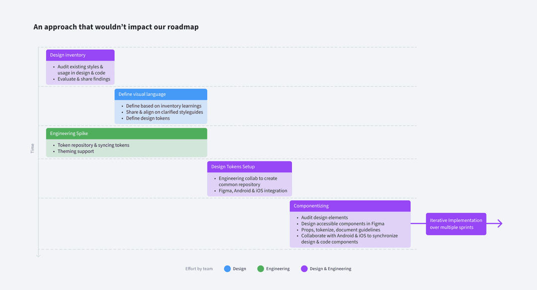
We needed an approach that doesn't just solve our problems today, but also sets us up for the future. I also had to come up with a plan that wouldn’t hinder our product roadmap.
Visual Inventory
Styling defined in code dictates the app's visuals. So I sat engineers to take an inventory of our styles. The inventory was performed across both apps, focusing on colors, fonts, and spacing to understand how we currently use our styles. These findings were then presented to the team.
Styleguide update
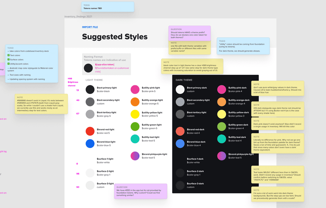
Taking feedback into consideration, I documented how we currently use our styles along with a proposal to make necessary updates. Most recommendations weren't 'new'. For example, we already had a good set of colors that worked. It just wasn’t always clear where to use what. This step clarified that.
Components for design and code
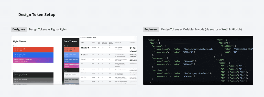
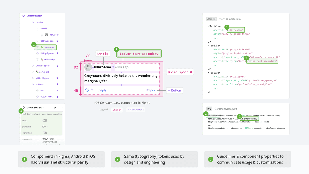
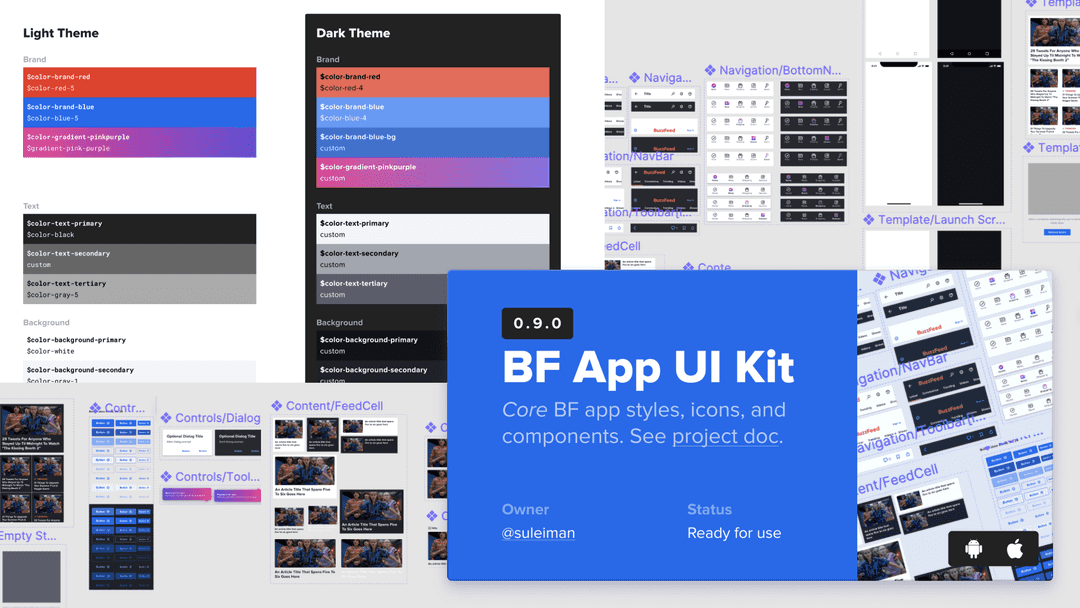
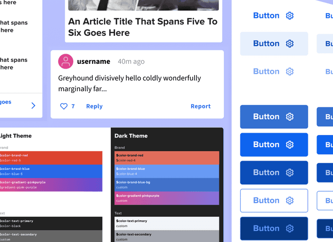
With design tokens established, I used it to craft a Figma component library. Working with engineers, we aligned our design and code components over time. This ensured consistency and simplified updates, strengthening collaboration across teams.
Iterative implementation
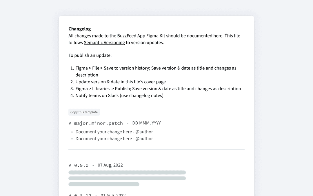
I version controlled the Figma library, using semantic versioning and maintaining a changelog for each update. Updates were published through the library and communicated through Basecamp and Slack. I coordinated with the apps team to schedule iOS and Android updates efficiently ahead of sprints.
Over time, the BF app design system became a resource for designers across product teams who were building features for the app
Outcome
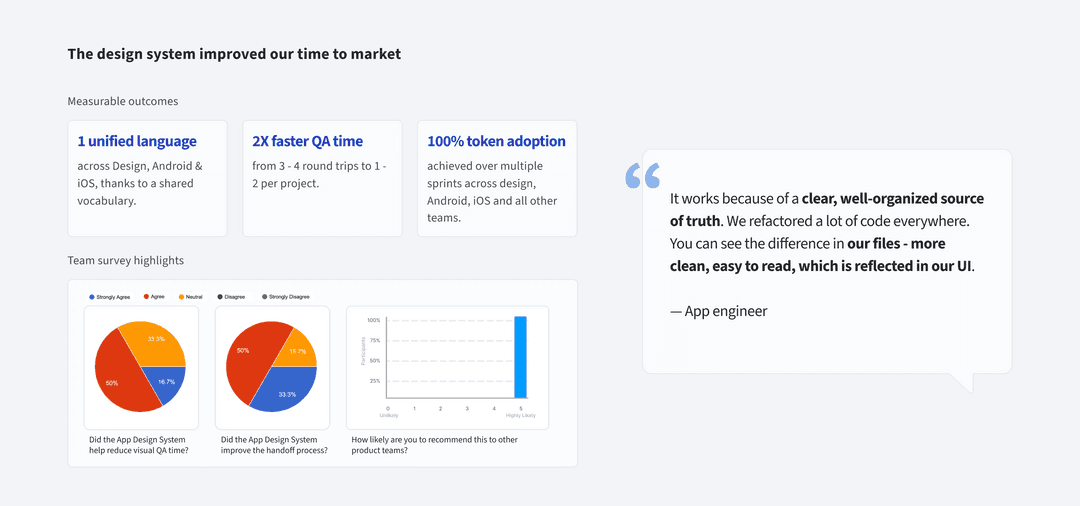
The design system was a scalable solution that stood the test of time. It transformed the app development process.
Success was measured through surveys. The reduction in time spent on design revisions and the number of inconsistencies reported during QA provided clear, measurable outcomes. Internal surveys and feedback sessions helped clarify how improved team morale and collaboration improved across teams.
Learnings and reflections
- Collaboration bridges gaps: Understanding each other’s (designers and engineers) workflows enhanced our efficiency and innovation.
- Small steps lead to big changes: Starting with manageable items and validating that built momentum that enabled significant, progressive improvements over time.
- Feedback fuels growth: Regular feedback sessions fine-tuned our approach and fostered a culture of continuous learning and adaptation.
